


Process
College Project
PAYTM KARO
Paytm has 300M+ users, but it grew by adding features and never by restructuring. Research showed 50+ features crammed onto one home screen, and users took over 3 minutes to find tasks like Split Bill or Water Bill. This project redesigns the app's navigation, information architecture and visual hierarchy so people can find what they need without feeling lost.
The solution: fewer visible options, grouped into familiar categories, with a personalised Quick Access bar and My Bills row, so any feature is under 3 taps away.

Research
Two personas built around critical tasks: Vedanti (22, student) who splits bills with friends, and Bharat (31, software engineer) who pays utility bills every month. Both journeys showed the same pattern: features buried several levels deep, no fallback when a contact isn't on Paytm, and a water bill flow with no clear entry point. The core causes were cognitive overload (30+ options on one screen), a broken visual hierarchy, inconsistent visual identity, and a homepage doing too much.

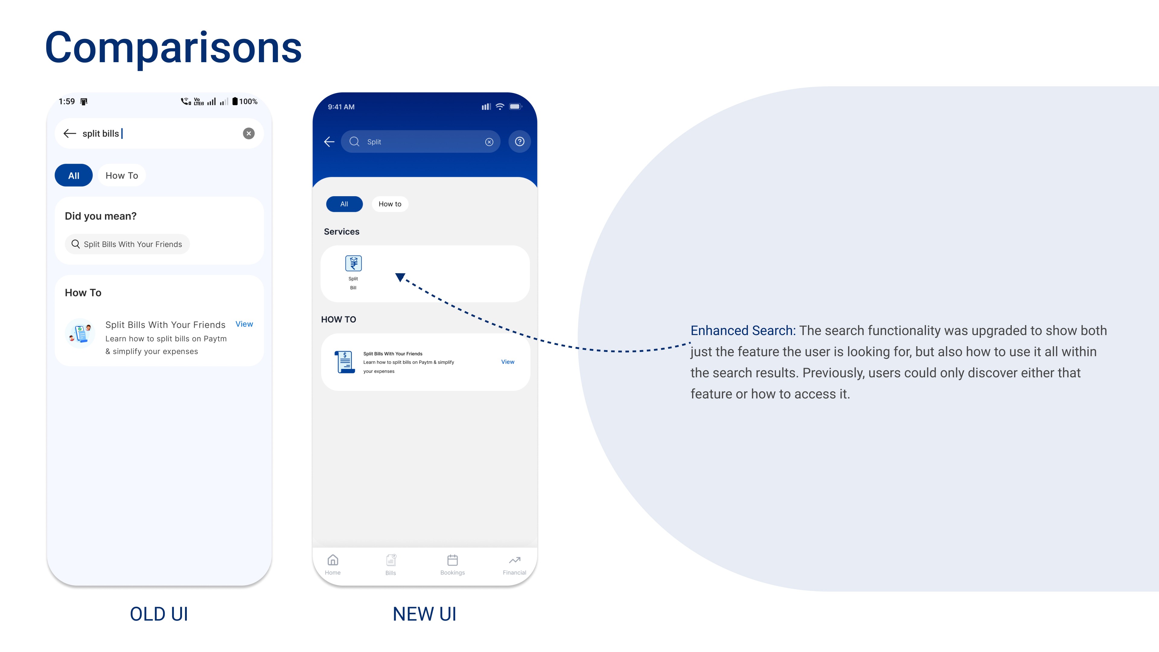
Old UI vs new UI: Split Bill
Related features are chunked into clear categories, and a customisable Quick Access panel lets users pin the ones they use most.



Old UI vs new UI: Water Bill
A My Bills row and Pending Dues with a visible Pay button replace the long list of billers.


Testing
Both critical tasks were tested with 3 users each using the System Usability Scale. Split Bill averaged 80.83 and Water Bill averaged 84.16. Feedback led to clearer labels ("Non Group Expenses" became "Split with anyone", "New Split" became "Quick Split"), a person icon on Pay Anyone, and moving "Add New" to the end of the My Bills row.
By Rakshita Issrani, Vageesha Agarwal


